Product Detail Page for Shoparize
Optimizing the Product Detail Page for Shoparize
Overview
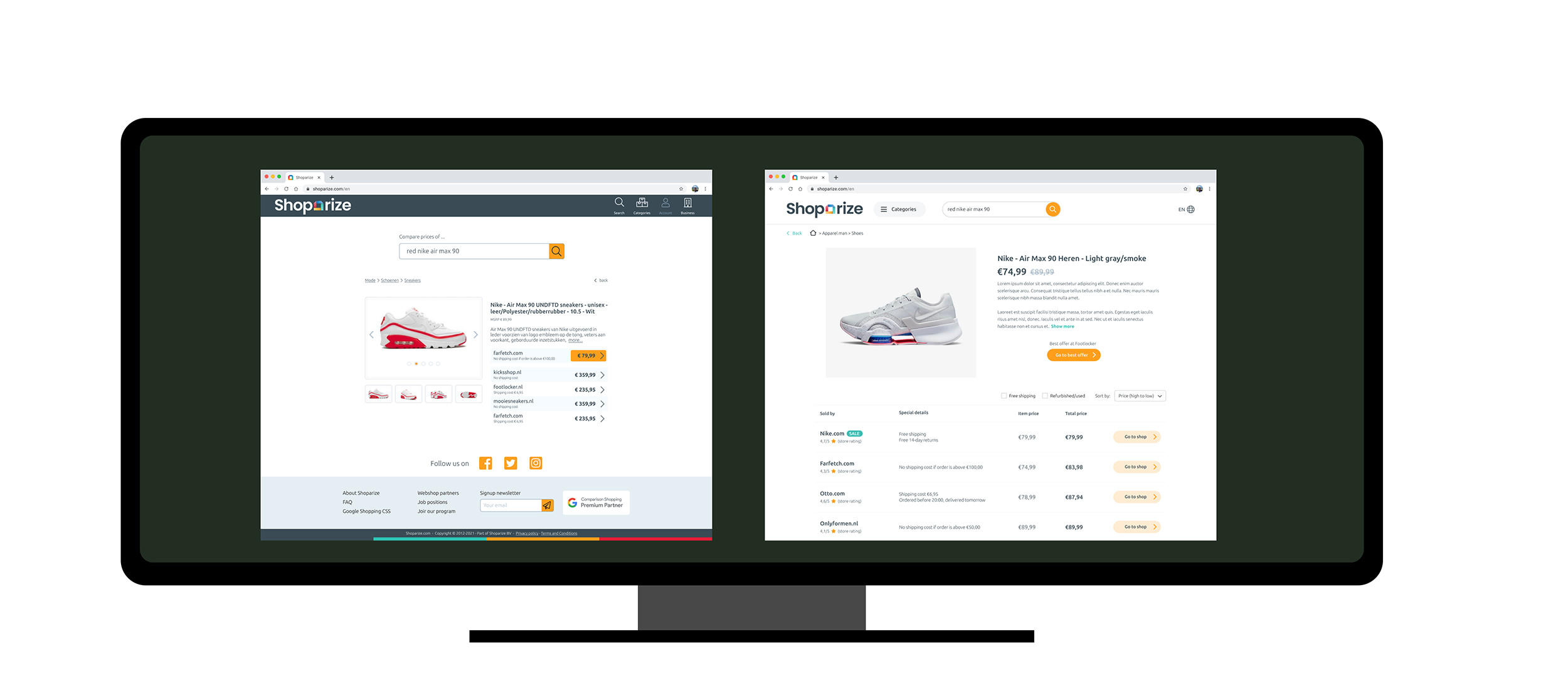
Shoparize helps users find the best place to buy a product by comparing prices across multiple retailers, including shipping costs and availability. The product detail page plays a critical role in that promise: this is where users decide whether they trust the comparison and take action.
This redesign focused on turning a high-exit page into a decision-making surface that supports comparison, builds trust, and guides users toward the best offer without overwhelming them.
Challenge
User analytics showed a high bounce rate on product pages and a relatively low conversion to outbound clicks.
Qualitative research revealed why.
The challenge wasn’t a lack of information, but a lack of decision clarity.
Solution
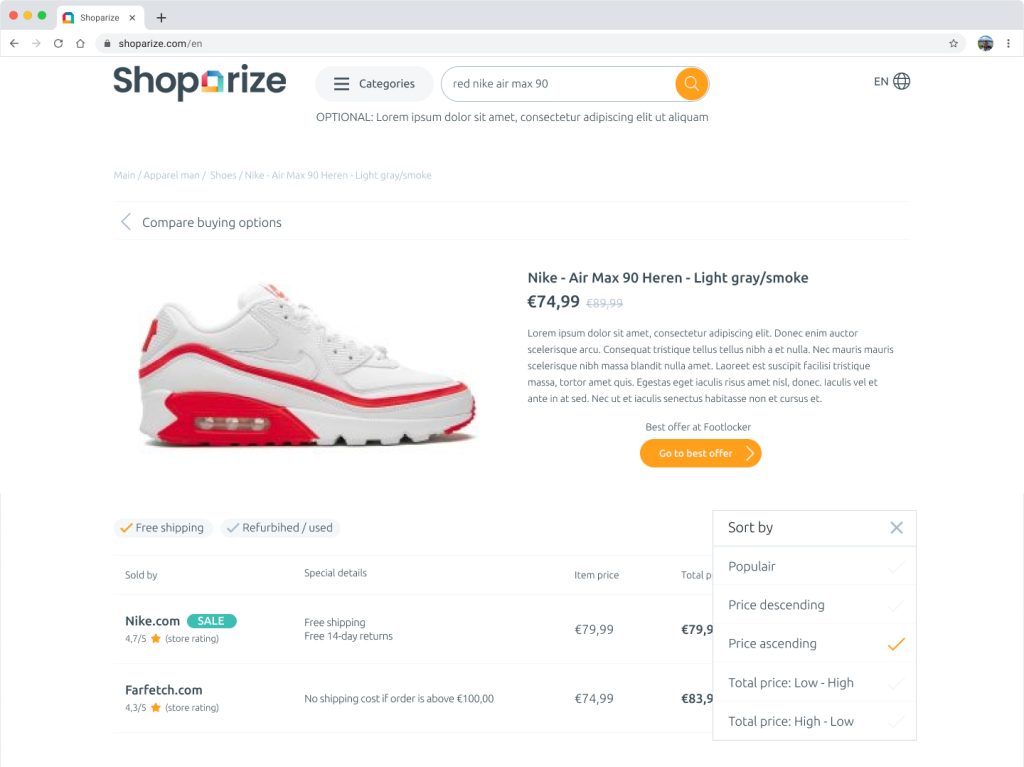
Instead of reducing information, we redesigned the page around how people compare, not how data is stored.
Key design decisions included:
We deliberately avoided “clever” UI patterns. The goal was calm, predictable clarity that supports fast scanning and confident decisions.
To reinforce trust, we integrated social proof such as store ratings and reviews directly into the comparison layer, so credibility is evaluated at the moment of choice, not before or after.
Results
The redesigned product detail page significantly improved both engagement and conversion metrics:
More importantly, qualitative feedback showed users felt more confident that they were making the right choice, even when the cheapest option wasn’t the obvious one.
Key Insight
Price comparison isn’t about showing the lowest number. It’s about helping users understand why one option is better than another.
By designing for comparison clarity instead of information density, the product detail page became a trusted decision tool rather than a noisy catalog screen.