Credion Loan Overview for B2B Users
Redesigning the Loan Overview Page for B2B Users
Overview
This case study covers the redesign of Credion’s loan overview for B2B users. The platform supports entrepreneurs dealing with complex, high-impact financing decisions, far beyond consumer loans. Due to low traffic volumes, insights were gathered through qualitative user interviews, persona development, expert reviews, and targeted usability testing, rather than large-scale analytics.
The goal was not simplification for its own sake, but clarity without loss of financial depth.
Challenge
B2B financing is inherently complex: multiple loan types, varying repayment structures, long-term cost implications, and high financial risk.
Users needed to:
At the same time, low traffic limited quantitative validation, requiring design decisions to be grounded in qualitative insight and domain understanding.
Solution
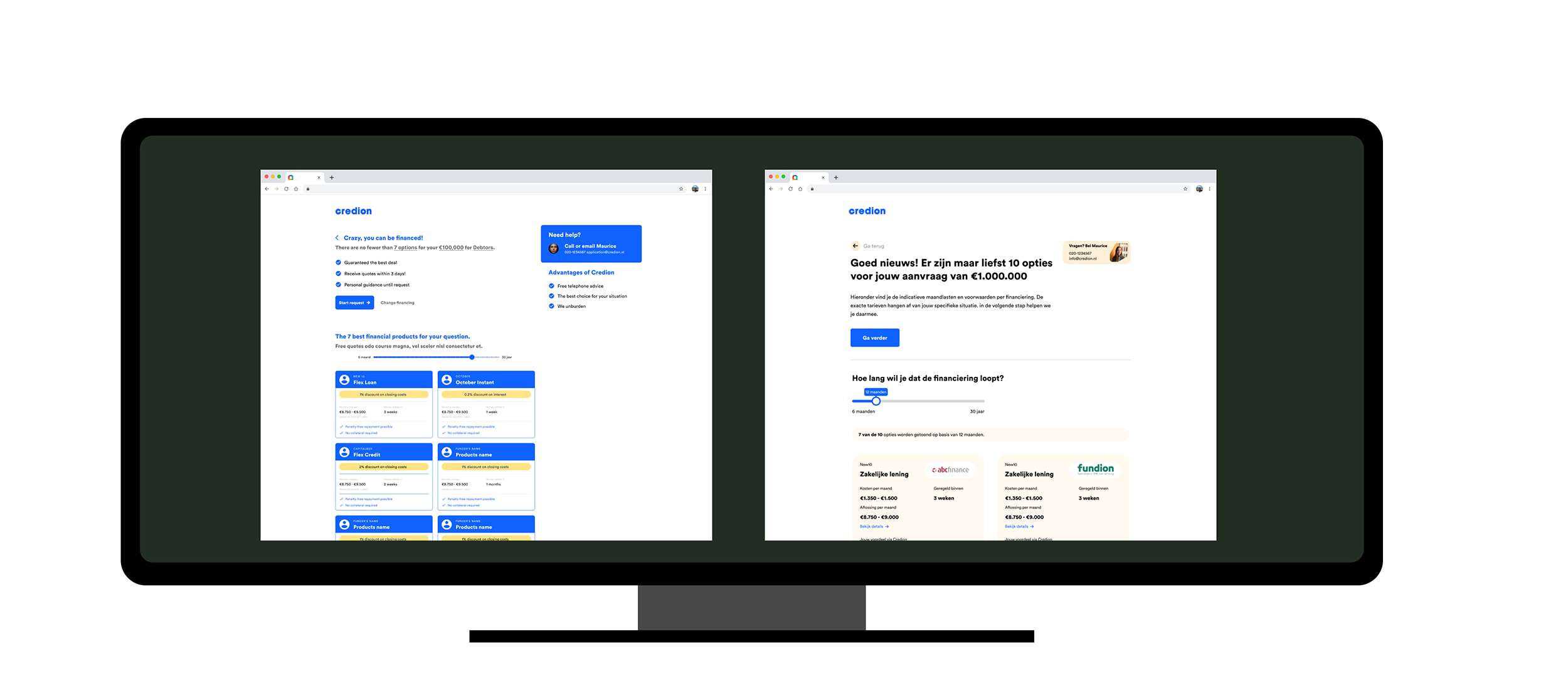
Instead of trying to oversimplify the application flow, we deliberately shifted complexity to a dedicated decision moment inside My Credion. This allowed us to keep the flow lean, while still supporting users where it mattered most: understanding and comparing their actual loan offers.
Business loans are rarely comparable by default.
Different structures, rates, repayment models, and conditions turn every comparison into an apples-to-oranges problem. Hiding that complexity would reduce trust rather than increase clarity.
To address this, we designed a side-by-side loan overview that helps users reason through real offers they received.
Instead of collapsing information, we structured it:
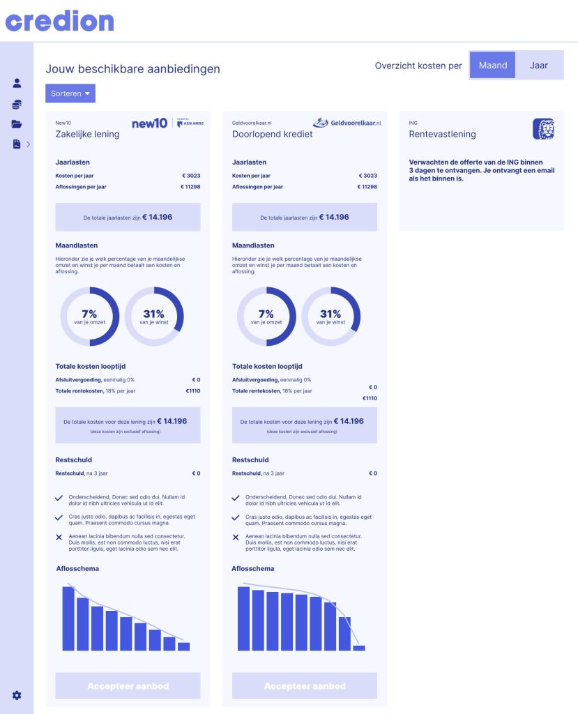
By moving complexity out of the flow and into a focused comparison space, we were able to simplify the application journey while offering deeper support at the moment of decision.
This approach respects how B2B users actually decide: not fast, but informed.
Results
Despite limited traffic, the redesign delivered measurable and qualitative impact:
The project demonstrates that user-centered design can significantly improve complex financial products, even in low-data environments, by combining strategic UX thinking with deep domain understanding.